
I've written about why "high, medium, low" fails a board. This is the other half of the story: what it looks like to do it properly. Here is a walk through FORLAS CRQ, using its built-in demo scenarios, so you can see the depth for yourself. Every figure below comes from the tool as it ships, running entirely offline on a laptop.
Every scenario, simulated 100,000 times
A single risk scenario in FORLAS is not one number. It is a full probability distribution, built by running the FAIR model a hundred thousand times and recording the annual loss each time. Instead of a point estimate that pretends to a precision it doesn't have, you get the whole shape of the outcome.
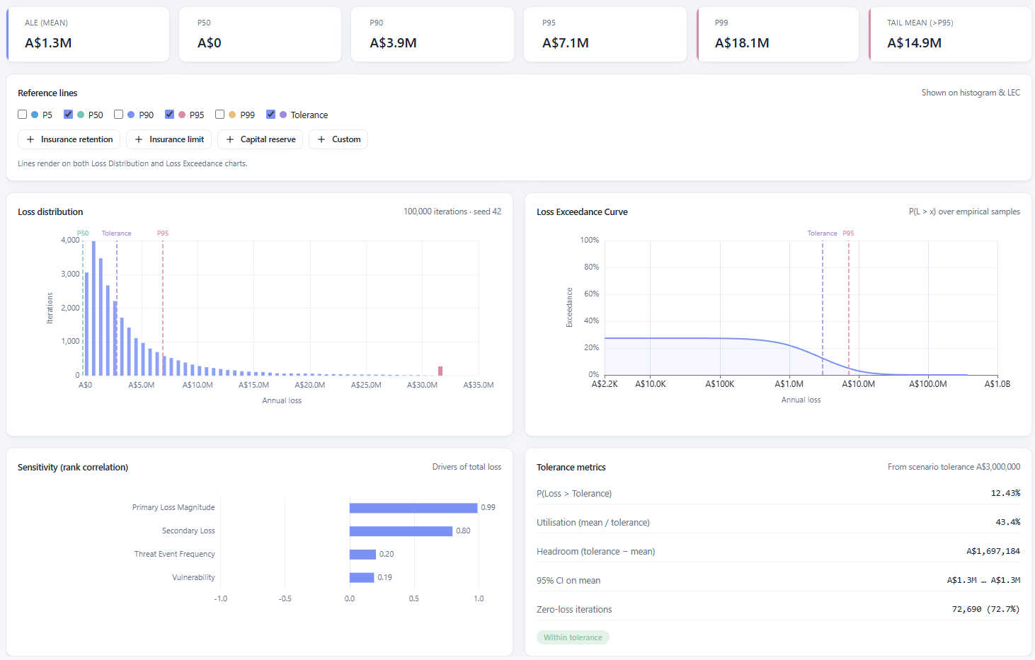
The result is expressed the way finance already thinks. An average annual loss, yes, but also the percentiles that actually matter for decisions: the P90, the P95, the P99, and the tail mean beyond the 95th percentile, which is the number that answers "when it goes badly, how badly". You read the loss distribution and the loss exceedance curve side by side, and every reference line, P50, P95, your tolerance, an insurance retention or limit, a capital reserve, can be laid over both charts at once.
Know what is actually driving the loss
This is the part most people don't expect from a free tool. FORLAS runs a sensitivity analysis on every scenario, ranking the FAIR inputs by how much they drive the total loss. In the scenario above, Primary Loss Magnitude correlates with the outcome at 0.99 and Secondary Loss at 0.80, while Threat Event Frequency and Vulnerability barely move the needle.
That ranking is a to-do list. It tells you where a better estimate would actually change the answer, and it tells your stakeholders which assumption to argue about. If the whole result hinges on primary loss magnitude, then that is the number to defend, and the debate about threat frequency is a distraction. Directing effort to the inputs that matter is the difference between analysis and theatre.
Measure against your risk tolerance
A loss number in isolation doesn't tell you whether to act. FORLAS measures each scenario against the tolerance you set and turns it into plain language: the probability of exceeding tolerance, how much of your tolerance the mean loss consumes, the headroom left in dollars, a confidence interval on the mean, and how often the simulation produced no loss at all. In the example, there is a 12.4% chance of breaching a A$3M tolerance, mean utilisation sits at 43%, and the scenario earns a "within tolerance" badge.
This is the language that turns a model into a decision. Not "the risk is amber", but "there is a one in eight chance we exceed the line we drew, and we have A$1.7M of headroom before we do".
Roll it up to a portfolio
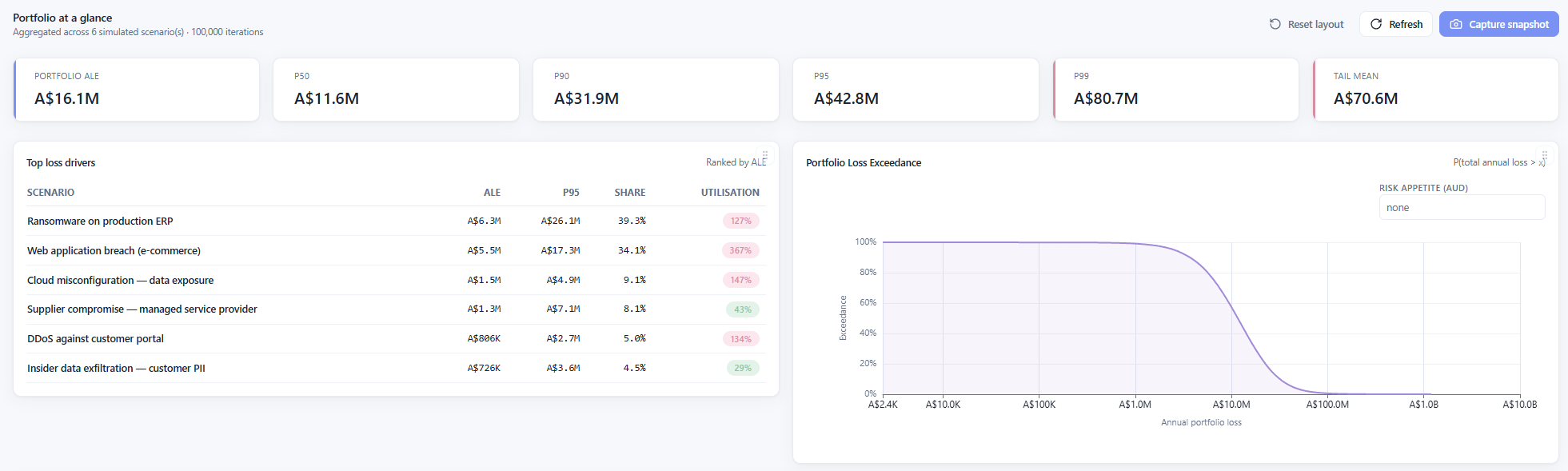
Individual scenarios are useful. A portfolio view is what a CISO actually presents. FORLAS aggregates every scenario into a single annual loss picture for the whole organisation, correctly combining the distributions rather than naively adding worst cases, and ranks each scenario by its contribution.
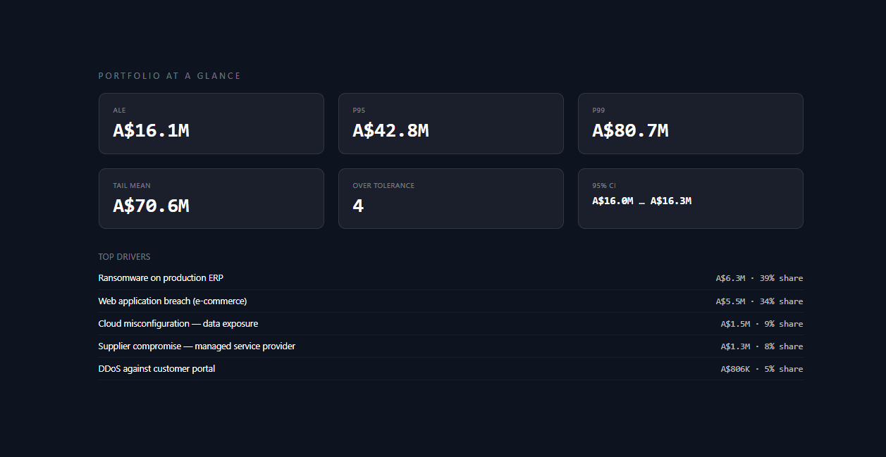
At a glance you see the portfolio's expected annual loss, its tail, and the handful of scenarios responsible for most of it. In the demo portfolio, a A$16.1M expected annual loss resolves into a clear pecking order: ransomware on the production ERP and a web application breach together account for nearly three quarters of it. That is a budget conversation with an obvious first move. You can set a risk appetite line and read the portfolio loss exceedance curve straight off, then capture the whole board-ready snapshot in a click.
Make it yours
FORLAS ships with a light and a dark theme, and every card on the dashboard and in the workspace can be dragged into the order that suits how you work, then saved. Small thing, but it means the view you present is the view you chose, not a layout someone else decided was best for you.
Show your working
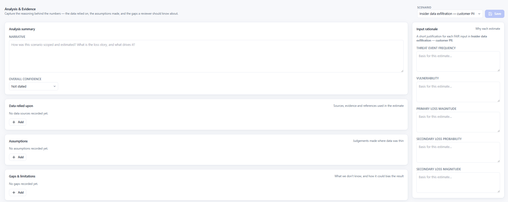
A number no one can defend is worse than no number at all. Alongside every scenario, FORLAS keeps an Analysis and Evidence record: the narrative and confidence behind the estimate, the data you relied on, the assumptions you made, the gaps you know about, and a short rationale for each individual FAIR input. When someone asks where a number came from, the answer sits right beside it, and it is captured in the audit log.
And it runs on your machine
Everything above happens locally. FORLAS CRQ is one desktop application with one database file that you own. No cloud, no accounts, no SaaS, no telemetry, no external services. The most sensitive risk analysis your organisation holds never leaves the building, because there is nowhere for it to go.
The established platforms that do this kind of work start in the five figures a year. FORLAS is free, open source, and in open beta: github.com/RiskByDesign/forlas-crq. Download it, point it at your own scenarios, and see what your risk looks like in numbers. If you do, I'd genuinely like to hear how you get on; the contact links are on the home page.